Corporate graphics and brand identity portfolio
Every brand has a story to tell
A selection of corporate graphic design, logo, brand identity and web design projects created for companies, professionals and commercial businesses.
Every project stems from listening and research, with the aim of building a polished, coherent and recognisable visual identity. From the logo to the website, every element is designed to communicate the brand's value authentically.
GRAPHIC DESIGN WORKS IN EVIDENCE
RaiCom
COMMUNICATION CAMPAIGNS
Brochures, A5 cards, invitations, rollups and advertising pages are the graphic material produced for RaiCom.
It is impossible to show everything, we can mention important productions such as My Brilliant Friend, In the Name of the Rose, The Stolen Caravaggio, among many documentaries, films and TV series.
The graphic material created is used to spread these productions, culture, talent and Italian history in the world.
www.raicom.rai.it
In collaboration with: Matteo Enrici of 3mastudio

Mannucci Lucilla Honey
LOGO & BRANDING
The request was to design the logo and a label with a simple "Miele" - Italian word for honey - the name of the producer and a slightly stylized bee.
A stylized bee is integrated into the word "Miele", a simple idea for a delicious mountain honey produced in the Province of Cuneo.
The dark background of the label with the golden color of the product amply highlights the image of the product.

Former Boves Cotton Mill
LOGO & BRANDING
The logo for Former Cotton Mill was created with the aim of enhancing the industrial and historical identity of the building.
The architectural profile of the structure becomes the main element of the brand, creating a direct link with the place and its memory. This is complemented by a stylised cotton flower, chosen to recall the original function of the cotton mill and add a more delicate and distinctive detail to the logo.
The result is a visual identity that combines history, character and contemporary elegance.
The following were chosen for the palette earth tones, inspired by the industrial aesthetics of the building, capable of conveying solidity, materiality and authenticity.

Amandine Patisserie
LOGO & BRANDING
Erika and Giorgia's request was to create a delicate but recognisable visual identity, inspired by almonds, with pastel colours and an aesthetic designed for a pastry shop dedicated to special events.
We have developed a visual language of soft, organic shapes, reminiscent of almonds, accompanied by a light tone palette, capable of conveying elegance and sweetness.
The result is a simple but distinctive corporate identity, where every element, from the logo to the packaging, contributes to telling a refined brand, designed for moments to remember.

Eico
LOGO & BRANDING
Eico is a company that works in the world of artistic perfumery and beauty. It presents itself as a dynamic company that focuses on customer care, offering customised perfumes, beauty treatments and make-up.
Looking for a fresh, youthful image, an appealing colour palette and a simple, attractive logo were identified.
All the brand letters have a direct relationship with the circular geometric shape, a figure that conveys a message of positivity and tranquillity, fully reflecting the brand values.

LaBoves
Logo, communication campaign & website
LBoves is a space dedicated to young people, created to host free creative workshops for boys and girls. The project is promoted by the Municipality of Boves, the CRC Foundation and the Emmanuele Cooperative, with the aim of creating a space for expression, meeting and growth through activities such as street art, graphic design, photography, yoga and much more.
The work involved building the project's visual identity., starting from the idea and positioning through to the development of all communication materials. The logo has been designed and a contemporary visual system has been defined, based on bold, bright, and recognisable colours, designed to attract a young audience and convey energy, creativity, and freedom of expression.
Flexible graphics have been developed, made of contrasts and dynamic colour combinations, able to adapt to different contexts, from digital to print, whilst always maintaining consistency and recognisability.

Crunchy
LOGO & BRANDING
"Croccante" means crispy, a simple word, but of strong impact, which refers to something good and tasty, like the fresh products that the owners produce.
The corporate graphics for this family-run business; fully represents their products, made of fresh and simple ingredients to be consumed in everyday life. "Croccante" sandwiches, warm croissants, accompanied by a good coffee. Thus was born the slogan that accompanies their name, "piacieri quotidiani" -daily pleasures-, because this is what Croccante offers.
In addition to the coordinated logo and image, the business premises were designed in cooperation with Andrea Dalmasso Architect

As before
Event & Floral
LOGO, BRANDING & WEBSITE
Come Prima is a company specialising in floral design and the staging of private and corporate events, with a meticulous, elegant approach strongly oriented towards the visual experience.
The work carried out involved the complete construction of the brand's identity, starting from the logo and branding through to the development of the website and coordinated communication materials. The aim was to visually translate the brand's positioning through a refined, recognisable, and coherent image, capable of best conveying the value of the service offered and the aesthetic world of Come Prima event & floral design.

House of Somatics
LOGO & BRANDING
Plumacreativa handled the design of the logo and visual identity for House of Somatics, a project dedicated to well-being and the reconnection between mind and body through experiences such as somatic coaching, events, and immersive retreats. The branding was developed to reflect the essence of the brand: a welcoming, intimate, and transformative space, conceived as an oasis where one can slow down, find balance, and listen to their body.
The result is an elegant and coherent identity, capable of conveying calmness, depth, and awareness, in perfect harmony with the values and experience offered by House of Somatics.

Anna Mascaro
Wedding Planner
LOGO & BRANDING
Dealing with Wedding, a very feminine and romantic colour palette was chosen for the corporate image.
The logo is based on the initials of its name, which are interwoven into one continuous line, creating a very clean and elegant image.
In addition to the logo, the business card, letterhead, folder and corporate website were developed.

La Casita B&B
LOGO, BRANDING, WEB DESIGN & INTERIOR DESIGN
Turning a small house in the city centre into a cosy B&B.
With La Casita B&B We wanted to create an independent, modern and cosy space to host tourists from the lower Piedmont region.
This work has been carried out down to the smallest detail, starting with the architectural design, with a new spatial redistribution to adapt the house to the new requirements, and then going on to study the image and graphics: developing the logo, branding and website.
Architectural Design dga architects.


Pepa Flaca
WEB DESIGN - ECOMMERCE
Design and realisation of the pepaflaca ecommerce.
Pepaflaca makes porcelain jewellery and accessories, and the idea was to convey the brand's values with a modern, minimalist site, where the protagonists were the beautiful handcrafted creations that the owner makes.
The main material is porcelain, which is why the predominant colour on the site is white, with black text giving contrast to the site layout.

Gastaldi Wood
WEB DESIGN
Design and realisation of the Gastaldi Legno website.
The site wanted to convey the rustic and natural look of wood, a company that has been working with this material for several years, producing furniture, fixtures and other carpentry work.

Archcasa Real Estate
WEB DESIGN
Design and realisation of the Archcasa Immobiliare website.
Archcasa Immobiliare is today a young and dynamic company, which however has very ancient roots, established in 1897, carried on with passion and dedication by four generations, to become today a landmark in the area.
History, dynamism and modernity are the values the owners wanted to convey on their website, in order to address a younger and more forward-thinking audience.

Let's talk about your visual identity
A brand that really speaks about you and your project
If you are looking for graphic support for your brand - from logo to website, from corporate invitations to visual communication - I will be happy to listen to your idea and evaluate together whether we can work well together.
You can fill in the form to request a quote and if everything seems in line, book a free 30-minute online appointment.
Tell me your goals and let's start building something really yours.
services
What can I do for you?
Brand Identity
& Logo
Web Design

Invitations &
corporate coordinates
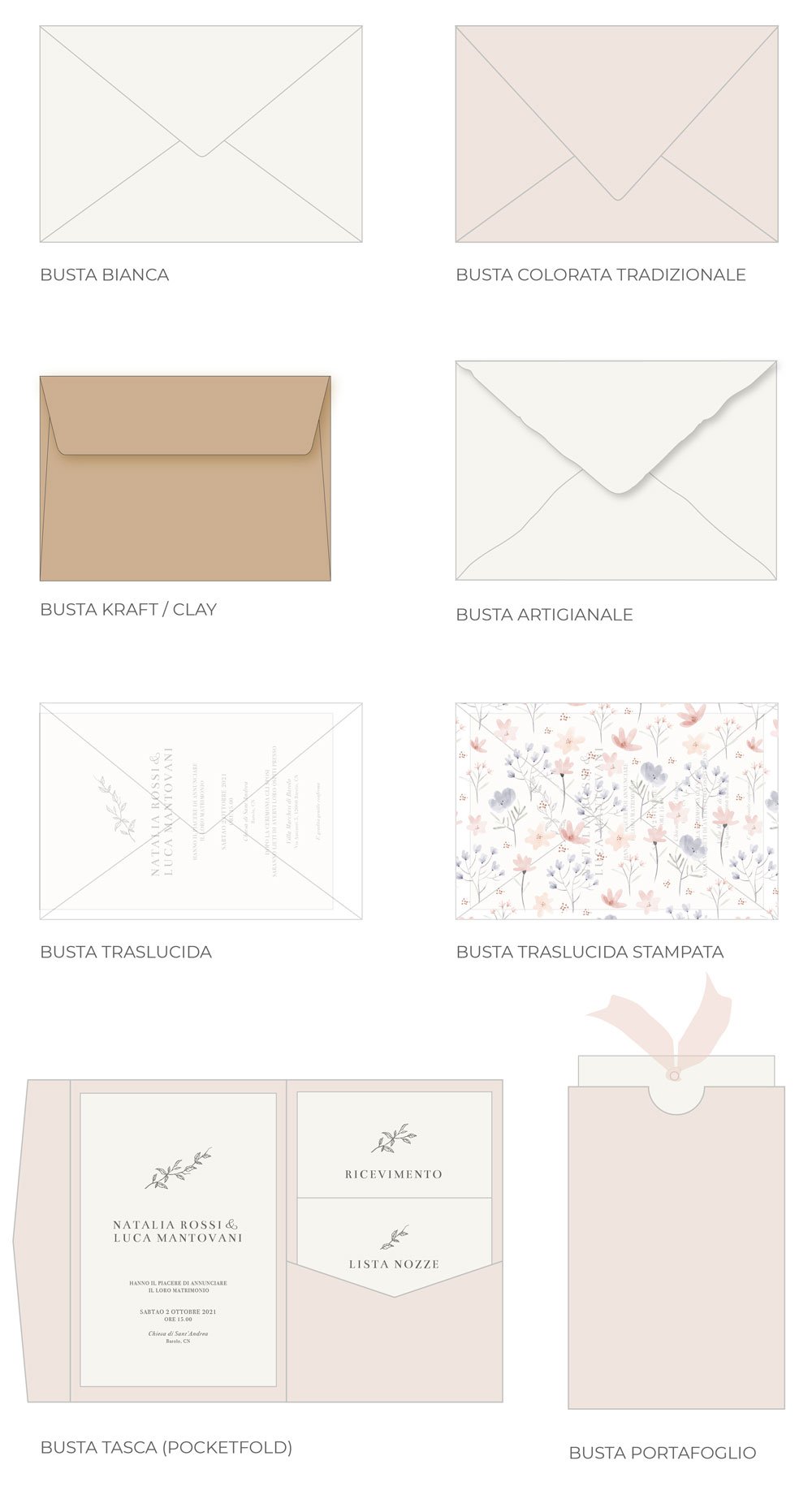
Greeting cards, event invitations, customised gadgets, postcards and printed materials to communicate your brand in an elegant and neat way.
I create customised corporate invitations for special occasions, anniversaries, dinners, networking events and important moments to share with customers and employees.
Entrepreneurial Planner
This weekly planner is designed to guide you and help you develop the strategies and entrepreneurial skills needed to run a successful business.
In our stationery line, you will also find beautiful desk and wall calendars, notepads, notebooks and notebooks.

Contact us
Fill in the form to request info or a quote